CSS Flexbox Implementation Cheatsheet
CSS Flexbox is a powerful layout model that helps us simplify and make webpage element layouts more flexible.
It's particularly suitable for responsive design scenarios. The model automatically adjusts element sizes and arrangements to adapt to different devices and screen dimensions.
This article provides implementation notes on CSS Flexbox based on the comprehensive guide CSS Flexbox Layout Guide.
Table of Contents
- Properties for the Parent (flex container)
- Properties for the Children (flex items)
- Other Recommendations
- Reference
Properties for the Parent (flex container)
Declaration
display
- Declaring that I want to use flex

Direction and Wrapping
flex-direction
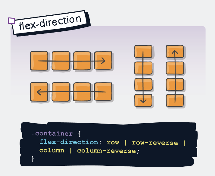
flex-wrap
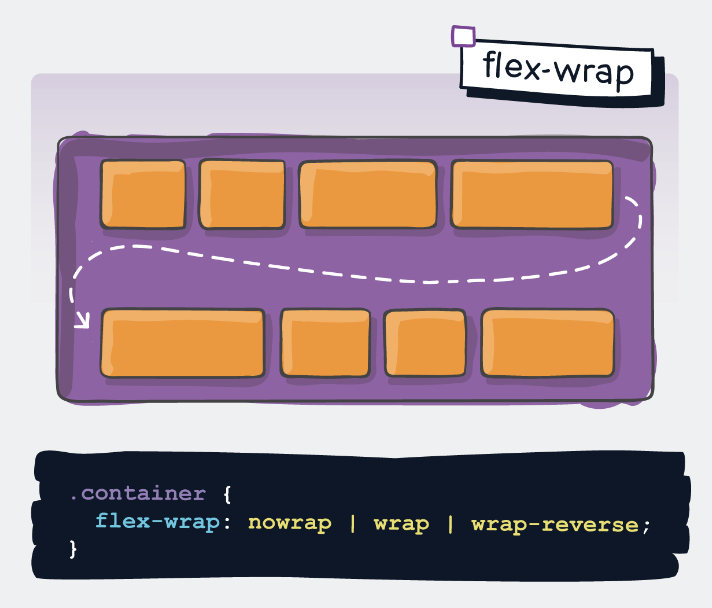
flex-flow
- = flex-direction + flex-wrap
- Default value is row nowrap

Alignment
align-content
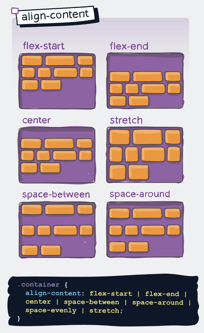
justify-content
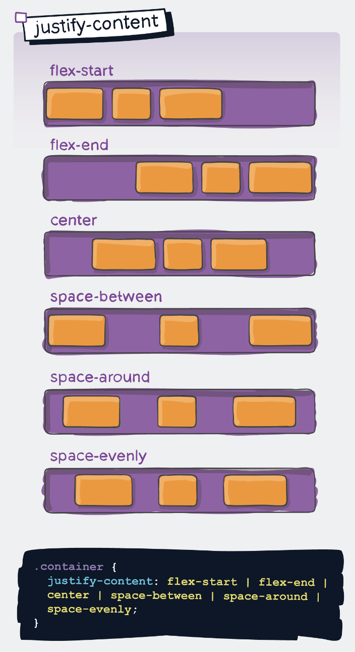
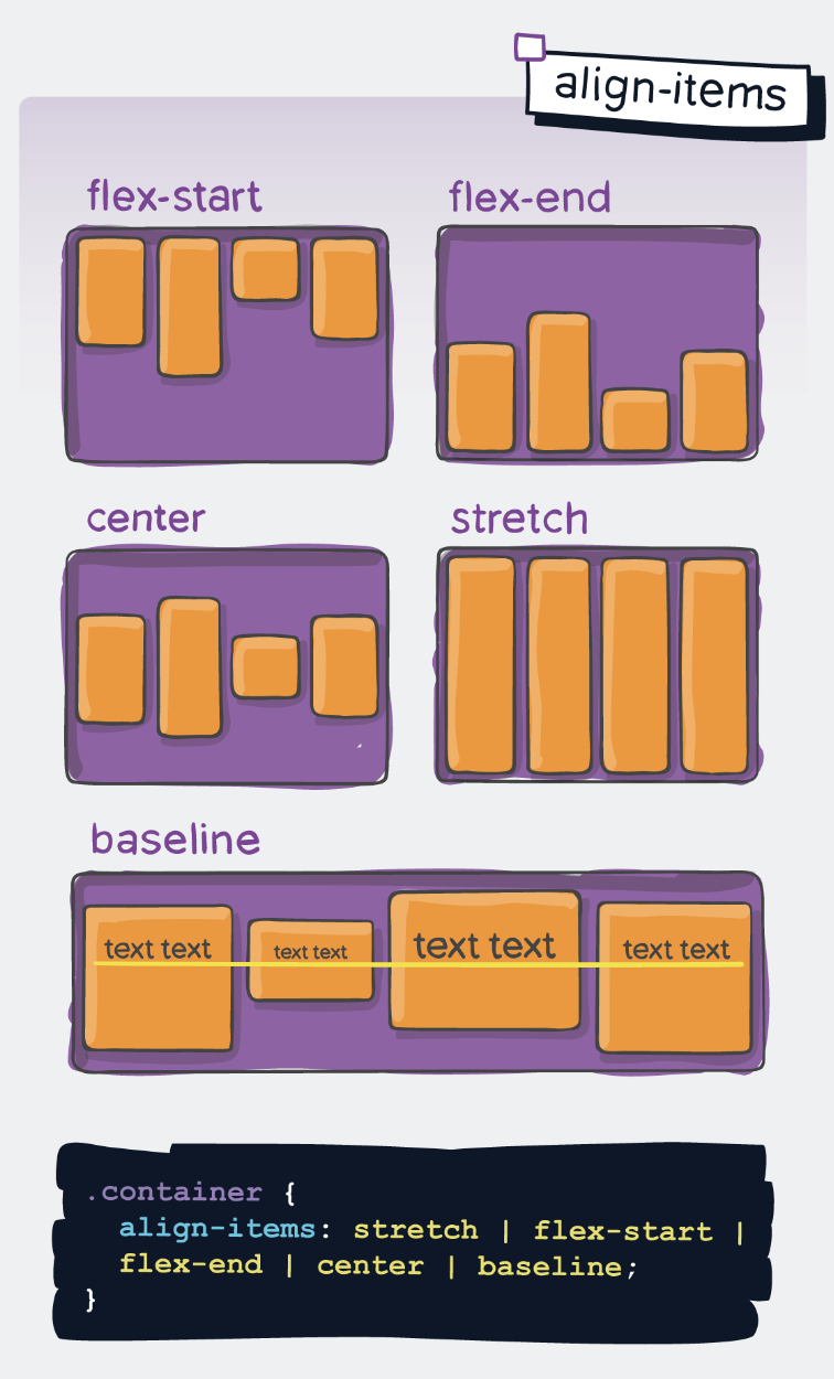
align-items
Spacing
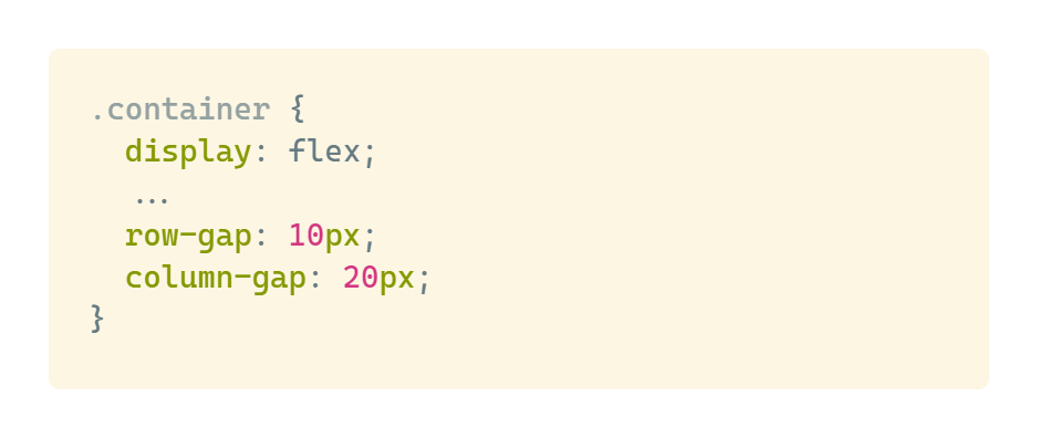
row-gap / column-gap
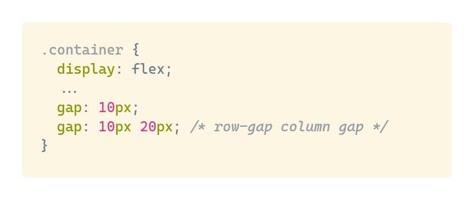
gap
Properties for the Children (flex items)
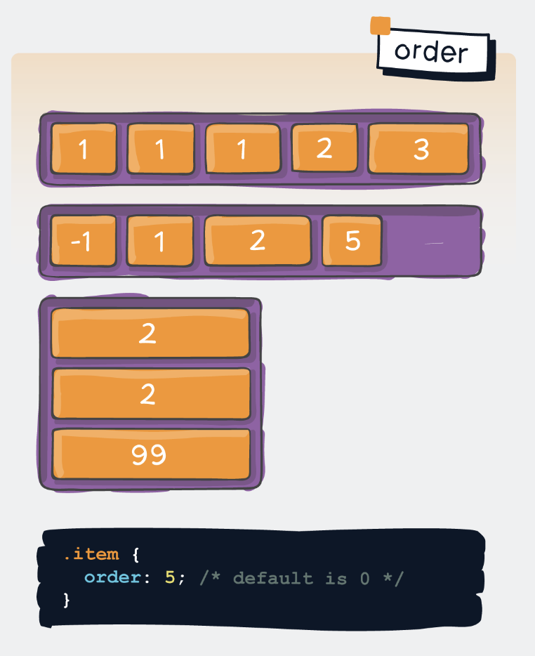
order
flex-grow / flex-shrink / flex-basis and their shorthand flex
These properties involve more complex behaviors and will be covered in a future update.
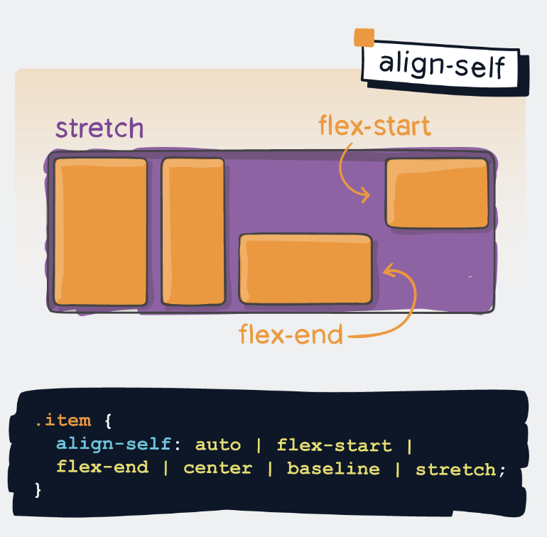
align-self
Other Recommendations
The Flexbox Playground website allows for testing these properties in real-time: Flexbox Playground.
