CSS GRID Implementation Cheatsheet
CSS Grid is a powerful two-dimensional layout system that helps you control the arrangement and size of web elements more flexibly.
It allows you to have precise control over rows and columns, creating complex layouts without relying on traditional techniques like floats or positioning.
This cheatsheet compiles key implementation notes for CSS Grid based on the comprehensive guide from CSS-Tricks.
Table of Contents
Properties for the Parent (Grid Container)
These properties apply to the container element that establishes the grid context.
Declaration
display
- Establishes a grid formatting context for the container

Grid
grid-template-columns / grid-template-rows
- Defines the size and names of grid lines and tracks
- You can specify width/height values or add [custom names] to label the grid lines
.png)
.png)
- A single grid line can have multiple names for more semantic references
.png)
- You can use the repeat() function to simplify repetitive patterns
.png)
grid-template-areas
- Defines named grid areas for creating visual layouts
- Works in conjunction with the grid-area property on child elements
.png)
.png)
grid-auto-rows / grid-auto-columns
- Controls the size of implicitly created grid tracks
- These properties define dimensions for tracks created when content overflows the explicitly defined grid
.png)
.png)
.png)
.png)
.png)
.png)
grid-auto-flow
- Controls how the auto-placement algorithm works for items not explicitly positioned
- Determines whether new items are placed by filling rows or columns first
Here's an example:
.png)
We define a grid with five columns and two rows, and set grid-auto-flow to row (which is also the default value):
.png)
When placing items on the grid, we only specify positions for two of the items:
.png)
Because we set grid-auto-flow to row, the grid will look like this:
.png)
If we change grid-auto-flow to column, then item-b, item-c, and item-d will flow down along the columns:
.png)
.png)
Container Overall
These properties control the alignment and positioning of the grid as a whole.
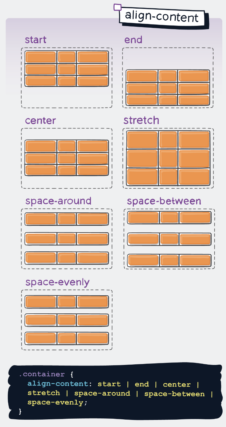
align-content
- Controls the vertical alignment of the entire grid within its container
- Applicable when the grid's total size is less than the container's size
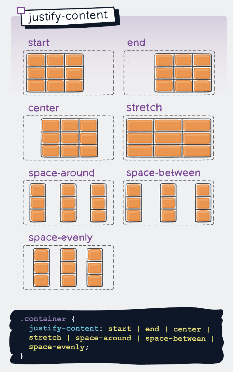
justify-content
- Controls the horizontal alignment of the entire grid within its container
- Applicable when the grid's total size is less than the container's size
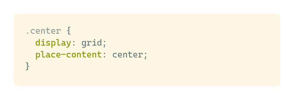
place-content
- Shorthand property that combines align-content and justify-content
- Usage: place-content:
- If only one value is provided, it applies to both properties
Within Container
These properties control the alignment of grid items within their grid cells.
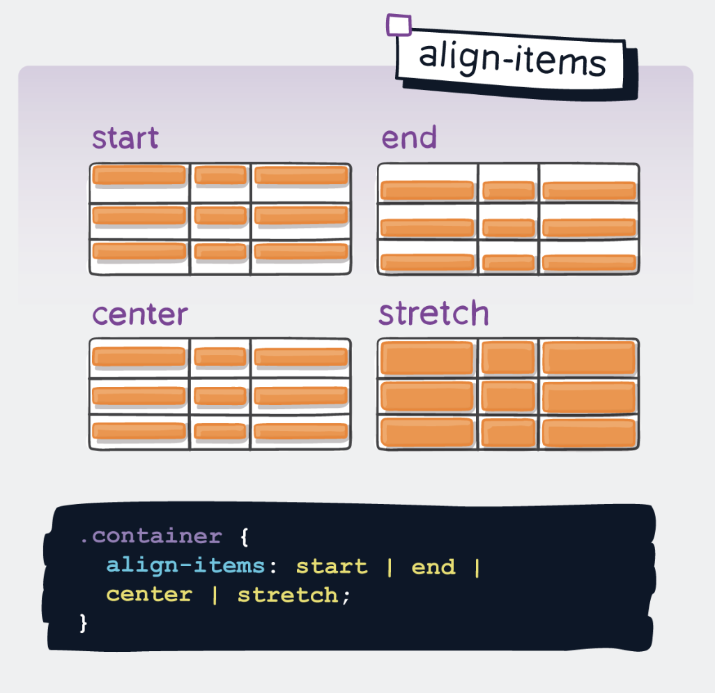
align-items
- Controls the vertical alignment of content within each grid cell
- Affects all grid items unless overridden by align-self
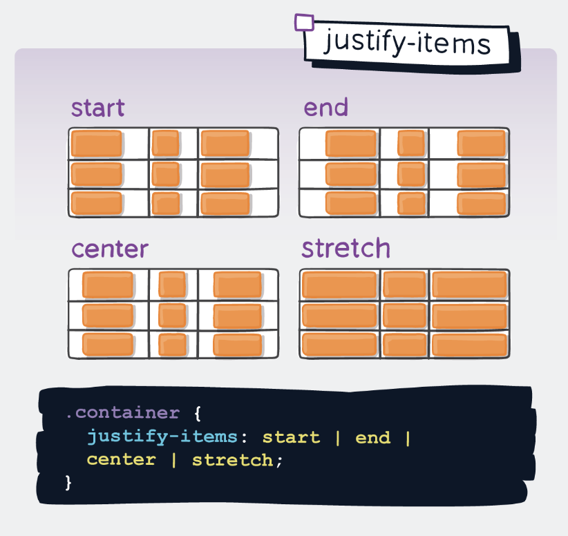
justify-items
- Controls the horizontal alignment of content within each grid cell
- Affects all grid items unless overridden by justify-self
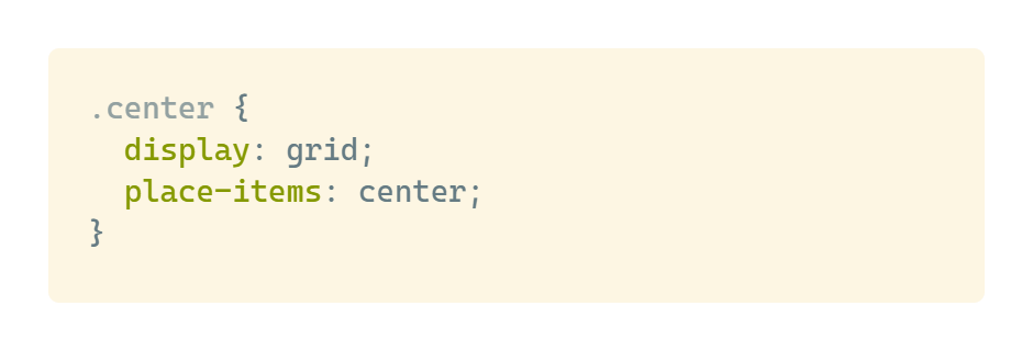
place-items
- Shorthand property that combines align-items and justify-items
- Usage: place-items:
- If only one value is provided, it applies to both properties
Grid Gaps
These properties control the spacing between grid cells.
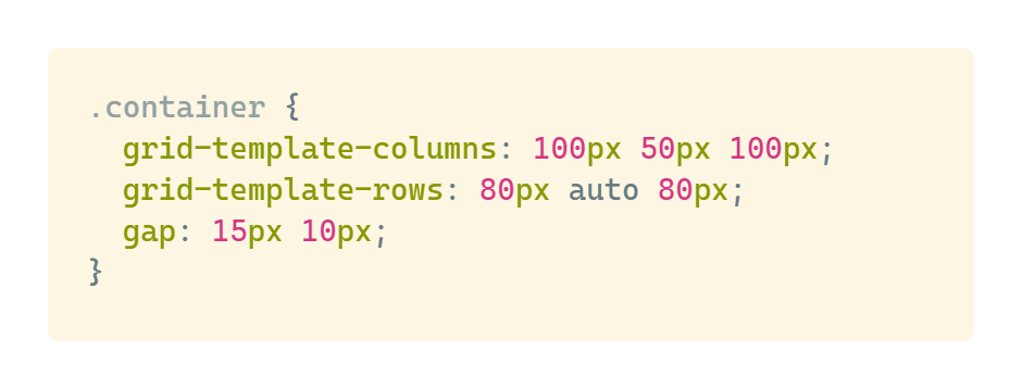
row-gap / column-gap
- Sets the size of gaps between grid rows and columns
- Creates gutters between cells without affecting the grid tracks
.png)
.png)
gap
- Shorthand property that combines row-gap and column-gap
- Usage: gap:
- If only one value is provided, it applies to both row and column gaps
Properties for the Children (Grid Items)
These properties control how individual grid items are placed and aligned within the grid.
grid-column-start / grid-column-end / grid-row-start / grid-row-end
- Determines the grid cell placement and span of an item
- References grid lines by number or name
.png)
.png)
.png)
.png)
- Notes
- If grid-column-end or grid-row-end is not declared, the item will span 1 grid track by default.
- Items can overlap each other. You can use z-index to control their stacking order.
grid-column / grid-row
- Shorthand properties for grid-column-start/end and grid-row-start/end
- Format:
/ or / span
.png)
.png)
.png)
- Notes
- If the end line value is not declared, the item will span 1 track by default.
grid-area
- Multi-purpose property that can be used in two ways:
- As a reference to a named grid area from grid-template-areas
- As a shorthand for grid positioning properties
.png)
- As a way to assign a name to an item:
.png)
- As a shorthand to set grid-row-start + grid-column-start + grid-row-end + grid-column-end simultaneously:
.png)
.png)
.png)
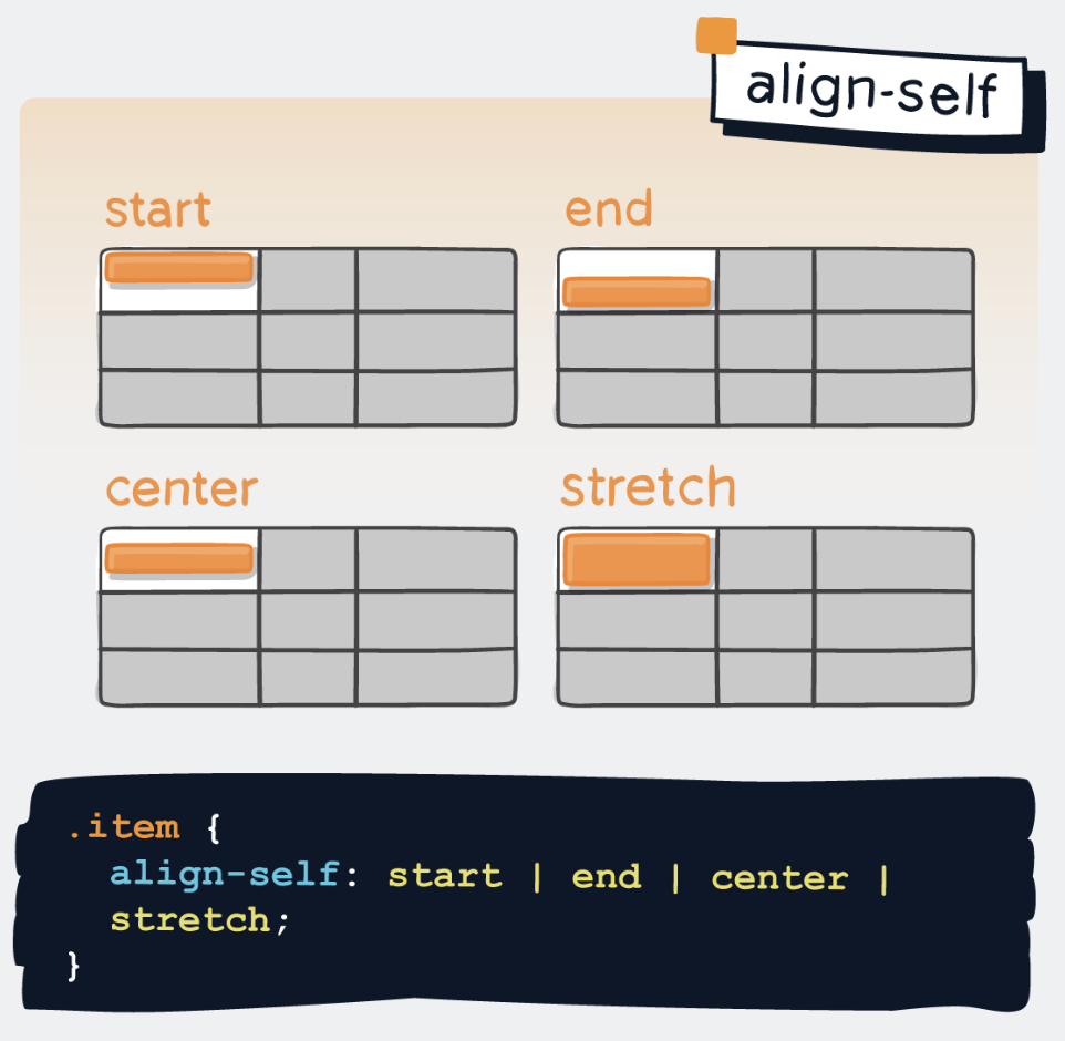
align-self
- Controls the vertical alignment of an individual grid item within its cell
- Overrides the align-items value from the container
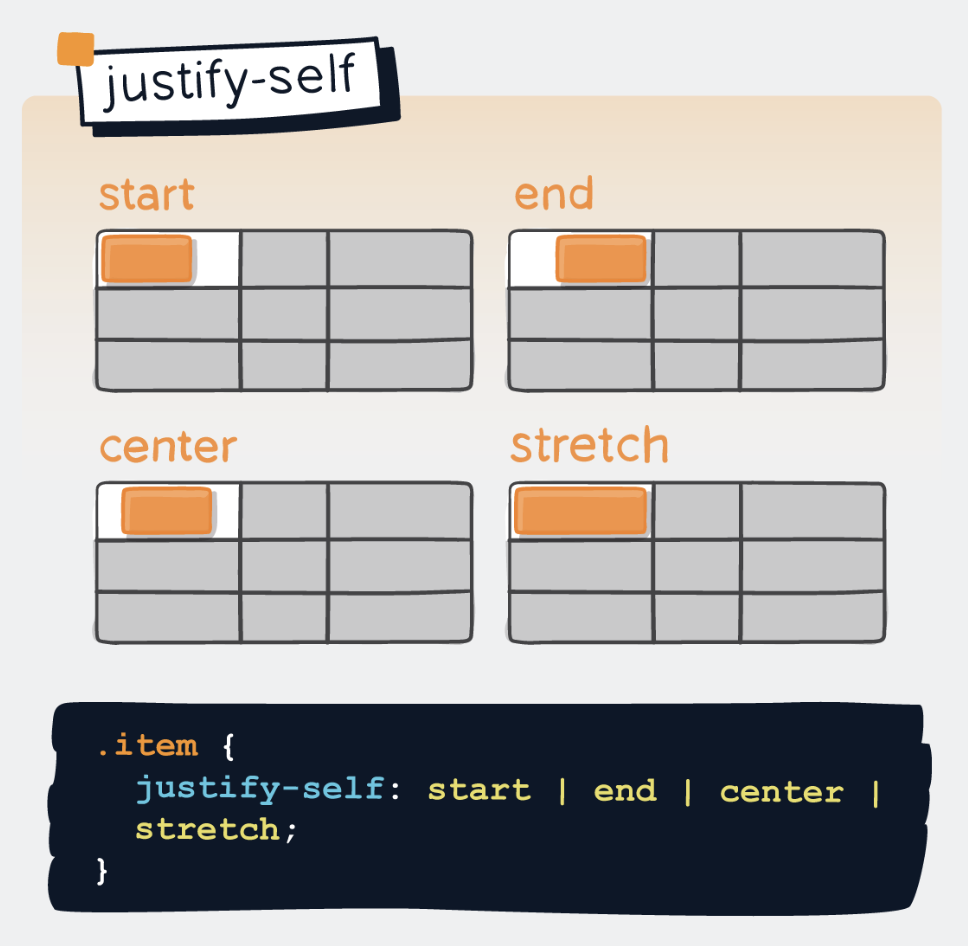
justify-self
- Controls the horizontal alignment of an individual grid item within its cell
- Overrides the justify-items value from the container
place-self
- Shorthand property that combines align-self and justify-self
- Usage: place-self:
- If only one value is provided, it applies to both properties
.png)
.png)
