Mastering Responsive Web Design
RWD stands for Responsive Web Design, a design approach that allows websites to adapt and display appropriately across various devices and screen sizes.
Regardless of whether users are on desktop computers, laptops, tablets, or mobile phones, a responsive website will adjust according to the device's screen size, presenting content in an optimized way.
The core goal of RWD is to provide a consistent and excellent user experience without needing to develop multiple versions of a website for different devices.
After taking the course Conquering Responsive Layouts by CSS master Kevin Powell, I'd like to share some key points and mindsets I've compiled for creating effective responsive websites:
-
Layouts are responsive by default; it's our CSS settings that break this natural responsiveness.
-
Avoid setting fixed widths, as they prevent automatic adjustment across multiple screens. Use percentages instead.
-
Avoid setting explicit heights whenever possible, as they can disrupt layouts across different screen sizes.
-
When setting font-size, using rem as a relative unit references the font-size of the html element (default is 16px); using em as a relative unit references the font-size of the parent element (default is 16px).
-
When setting margin, padding, and other non-font-size CSS properties, using rem as a relative unit references the font-size of the html element; using em as a relative unit references the font-size of the same element.
-
In most cases, rem is more suitable for setting font-size, while em is better for setting margin and padding.
-
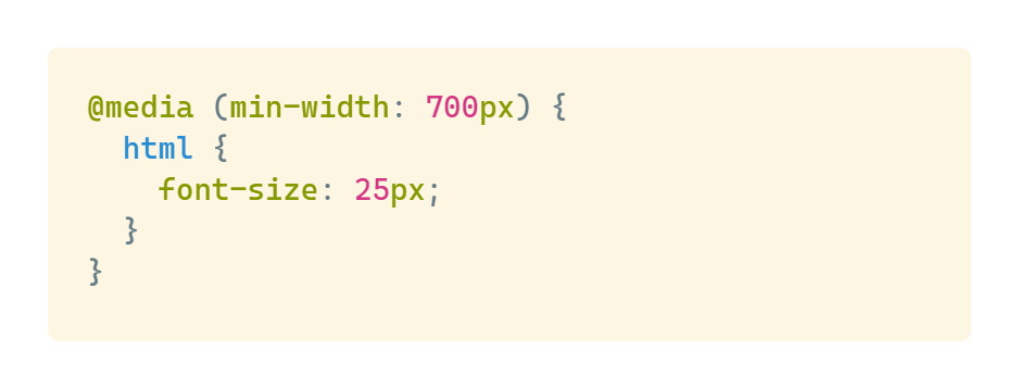
Using relative units makes implementing responsive layouts much simpler. For example, simply changing the font-size of the html element in a media query can easily scale the entire webpage on larger screens.
-
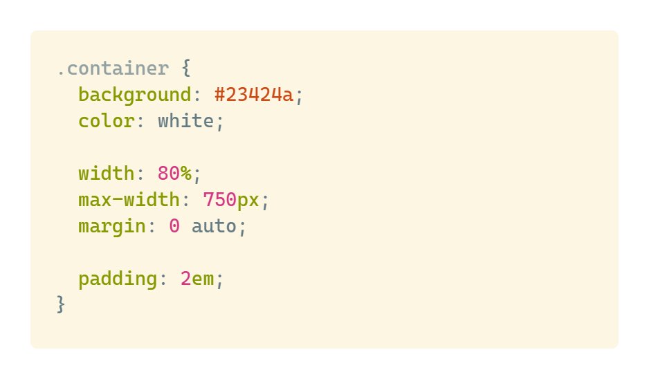
Use max-width to prevent excessive width on large screens. For example:
-
CSS Units: vh, vw, vmin, vmax
-
vh = viewport height, vw = viewport width.
-
If you want to center an element in the layout, you can set its height to 100vh and use align-items/justify-content: center.
-
If you want an image to take up half the total layout width, that would be 50vw.
-
The difference between vmin and vmax is that vmin refers to the smaller dimension between vw and vh, while vmax refers to the larger dimension. For example, in a window with dimensions 1280px _ 1600px, vmin refers to 1280px and vmax refers to 1600px. The settings are ratios - 120vmin means 1280px _ 120%, while 80vmax means 1600px * 80%.
-
-
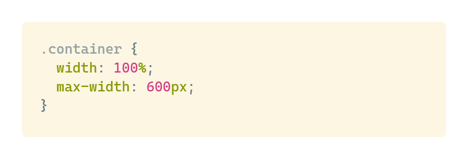
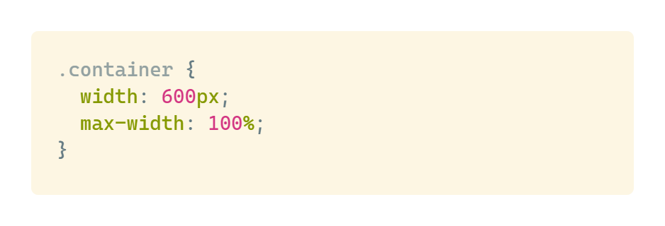
The two settings below are essentially the same, but the first approach is more intuitive, so I prefer to use it:
-
Additional notes: min(), max() and clamp() functions provide powerful tools for creating responsive designs without media queries:
-
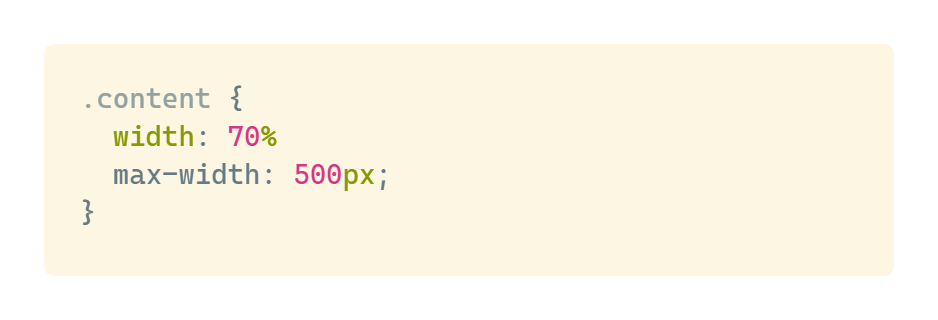
min() syntax allows you to set a value that will choose the smaller of two options:
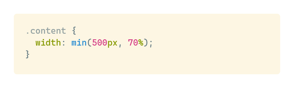
The above syntax is equivalent to:
-
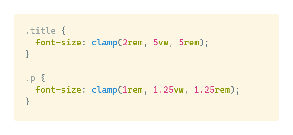
clamp() syntax allows you to define a size that scales within a range, setting minimum and maximum values with a preferred value in between:
-


